UX DESIGN CASE STUDY

New website for the Washington State Auditor’s Office

Home page of the Washington State Auditor's office website seen on a tablet and phone.

SAO website: overview and goals

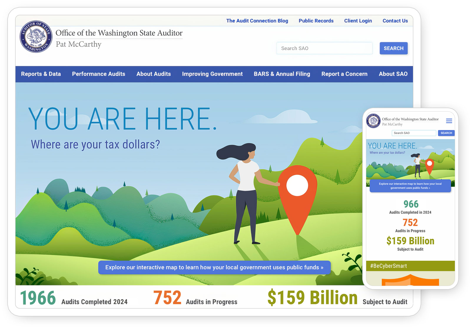
Washington is unique in having one agency that audits every entity spending public money, from small volunteer fire districts to large counties. Every local government submits financial reports annually or more to the State Auditor’s Office (SAO). This wealth of public spending data provides a significant opportunity for SAO to inform the public about the use of their tax dollars.

To serve multiple audiences, including the general public, government accountants, legislators, journalists, and financial analysts, I designed a site featuring interactive maps, downloadable audit reports, and user-customizable manuals.

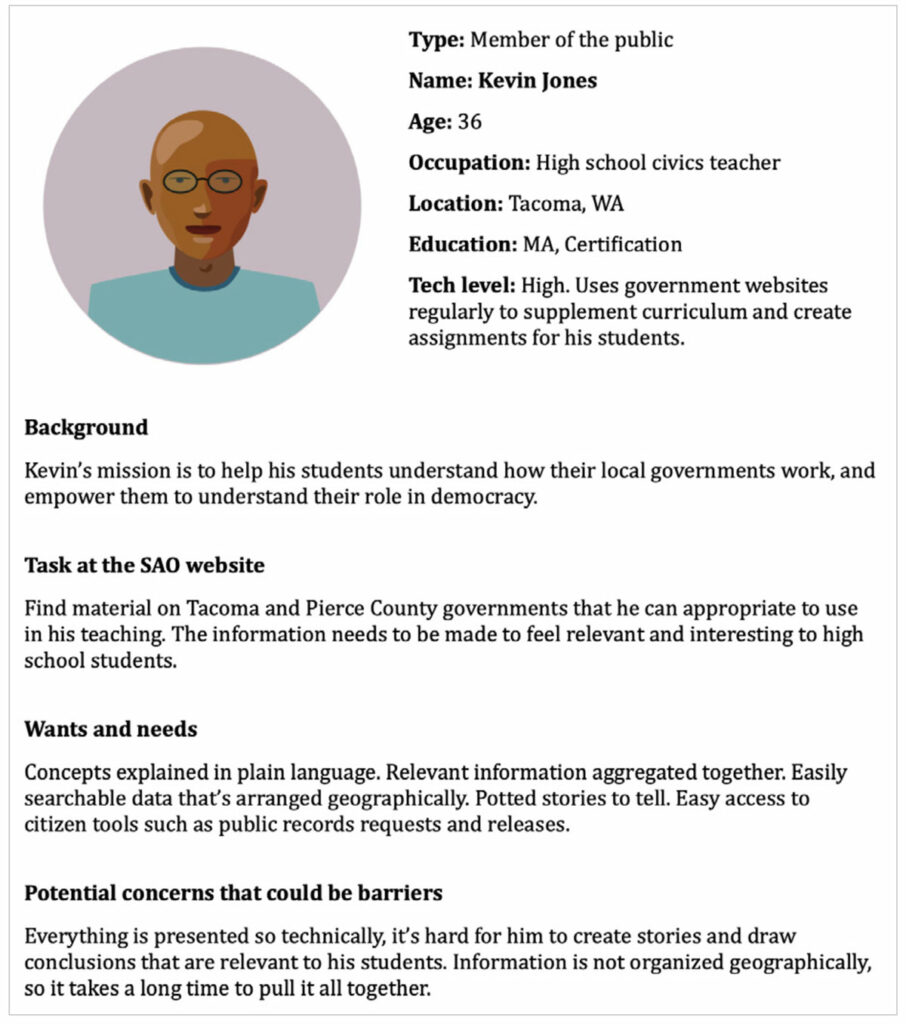
AUDIENCES: general public, journalists, legislators and financial analysts

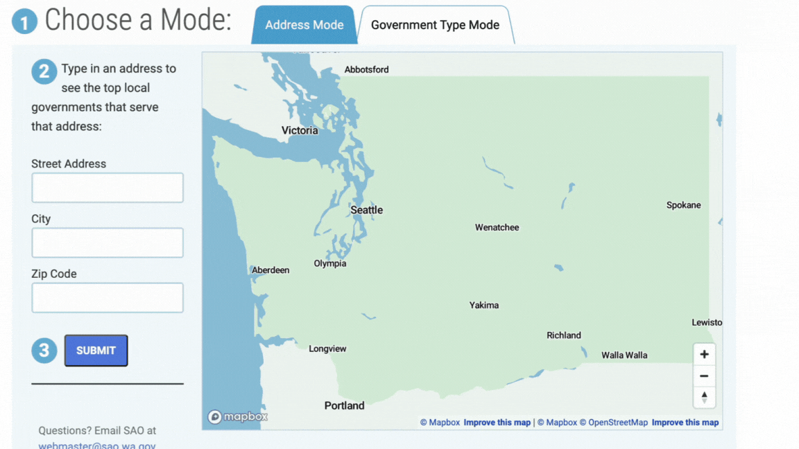
SAO Highlight: Interactive Map of Governments

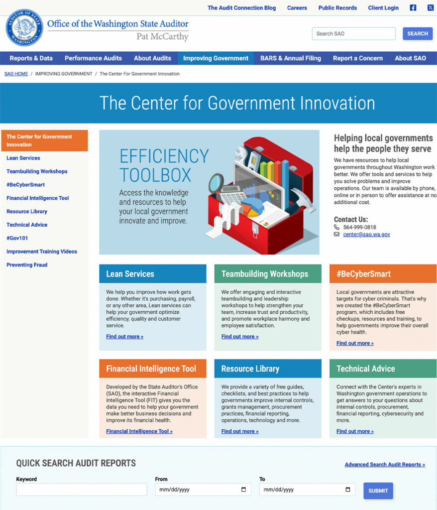
To make government financial data easily accessible by location and government type, I designed an interactive map of Washington state. Visitors can enter in any address to see the financial information of various government entities – county, city, fire district, etc. serving that location. Users can also filter by government type to compare revenues and expenditures of entities like library districts or ports. The map allows users to download the most recent audit reports and access a database of all previous reports with one extra click.

A GIF animation of the interactive map of Washington State governments on the Washington State Auditor's website.
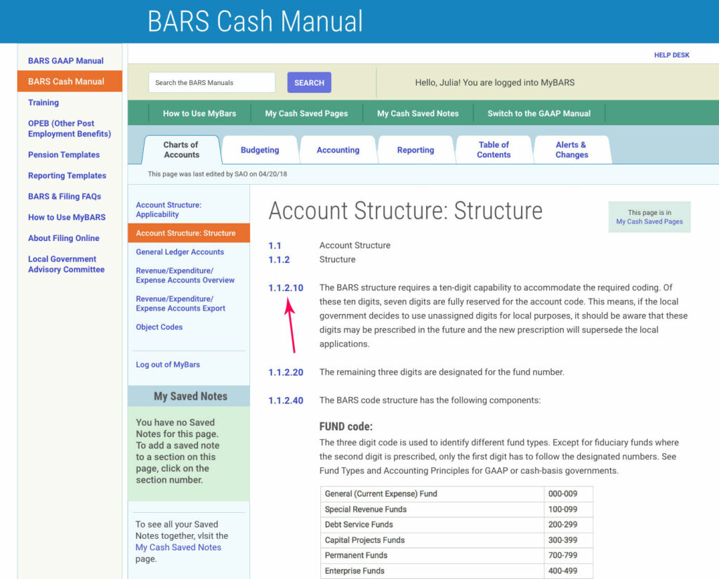
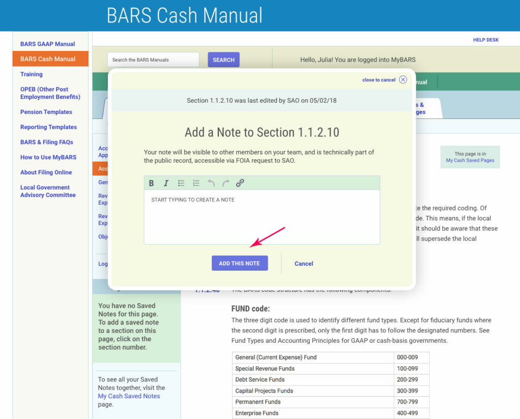
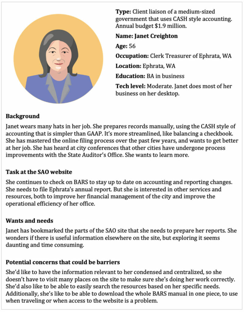
AUDIENCES: local government client liaisons and accountants

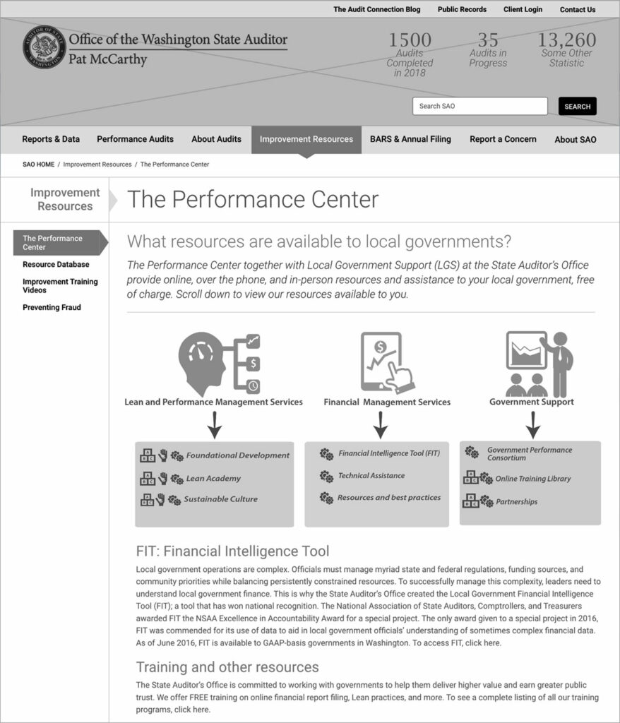
SAO Highlight: User-Customizable Online Manuals

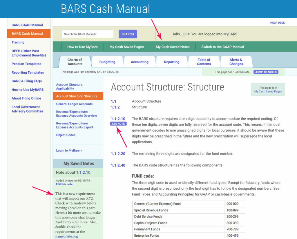
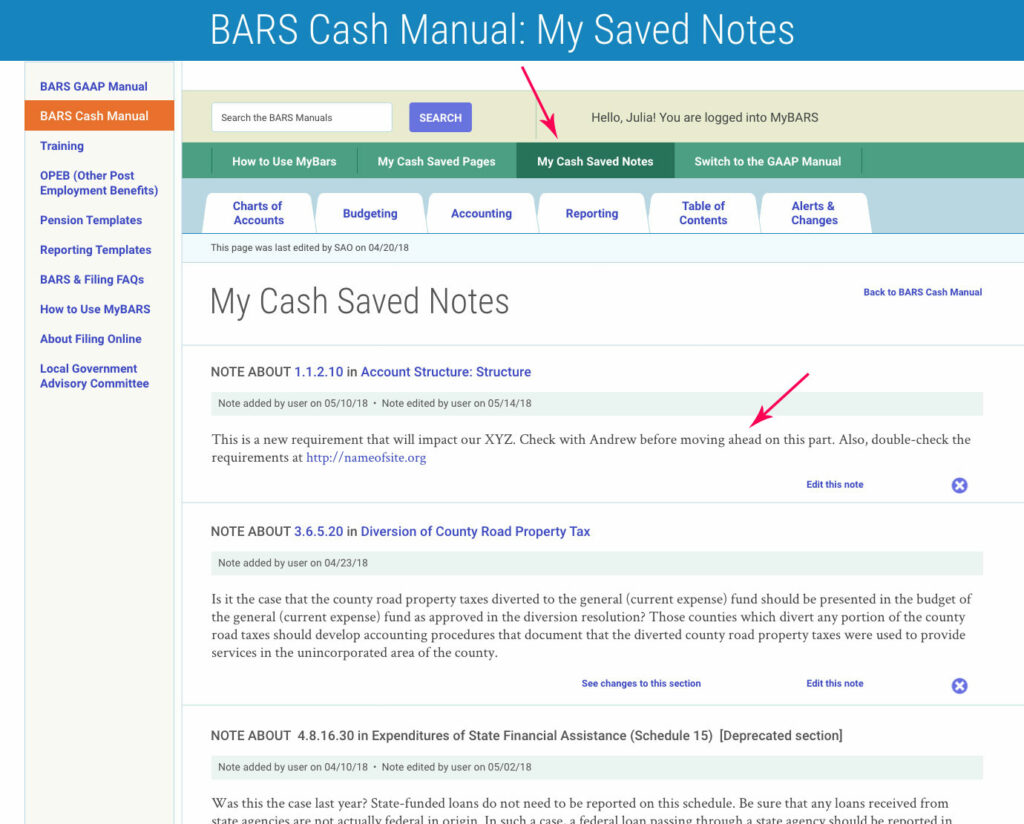
Thousands of local government entities submit financial reports to SAO and need access to SAO’s frequently updated BARS manuals. Audience research revealed that these accountant-liaisons were printing the massive PDF manuals to annotate them, which quickly became outdated. To address this, I designed a members-only platform called MyBARS, allowing users to access the BARS manuals dynamically. Members can add annotations, gather rules into customized collections, and see real-time updates while preserving their unique content.

(Note there are public-facing versions of the BARS manuals that do not contain the members-only functionality.)

A MyBARS workflow: save a note 1

After logging in to this members-only tool and choosing either the “CASH” or “GAAP” accounting manual, a MyBARS user selects a section to annotate by clicking on the blue section number, e.g. 1.1.2.10.

MyBARS manual workflow for government accountants: pane 1.
MyBARS manual workflow for government accountants: pane 2.

A MyBARS workflow: save a note 2

A modal window pops up that invites the user to write a note. A WYSIWYG allows basic formatting. When the user clicks the “ADD THIS NOTE” button, the note is saved to the user’s personal collection, and the modal disappears.

A MyBARS workflow: save a note 3

The page now shows a small “SEE NOTE” button next to the section number, along with the note itself in the left sidebar.
 
Clicking on the “SEE NOTE” button or the “My Cash Saved Notes” tab in the green menu bar near the top takes the user to their collection of saved notes.

MyBARS manual workflow for government accountants: pane 3.
MyBARS manual workflow for government accountants: pane 4.

A MyBARS workflow: save a note 4

In the “My Cash Saved Notes” page, the MyBARS user can see and edit all their saved notes in their collection.

Similar functionality works for “MyCash Saved Pages”, and for saving notes and pages within the GAAP Accounting portion of the MyBARS manuals.

SAO website: research methodologies

I began working with SAO with a deep dive into the agency’s business needs, meeting with internal stakeholders in several discovery workshops. I learned about SAO’s aspirations and goals, their primary and secondary audiences, and the ways the current site was holding them back.

Personas

To keep my team and the client grounded in the audience segments and their particular needs, I developed seven personas representing primary user types, from financial directors of large ports to part-time secretaries for small towns to high school civics teachers.

SAO website persona: Janet, Clerk Treasurer of the City of Ephrata, WA.
SAO persona: Kevin, High school teacher in Tacoma, WA.

Focus groups

I held focus groups with government accountants, journalists, and representatives of the general public to understand their use of the SAO site and their needs. I asked them what they specifically use the SAO’s site for, their experience of using the site, and what the site could do differently to make their jobs easier.

A group of participants finish a card sort test at an in-person focus group for the SAO website.
A set of cards laid out as the result of a card sort test participant identifying what they thought were the main content buckets within the SAO site.

In-person card sort test of the information architecture

An in-person card sort test of the existing site structure revealed significant differences between users’ understanding and SAO’s content organization, indicating a need for reorganizing the information architecture. The image is captured from one of the test participant’s contributions.

This exercise revealed that these users’ mental models of SAO’s content diverged significantly from how SAO had arranged and prioritized that content.

To make a website as user-friendly as possible, it’s often necessary to forgo organizational categories in favor of user categories, and these discovery activities gave us qualitative information that alerted the client of the need to change the information architecture.

Survey, and draft navigation map

I then created a 19-question survey that was sent to 5,000 people, which garnered 450 high-quality responses.

These responses, along with insights from the in-person workshops and the personas, informed the new information architecture draft.

An early navigation map of the Washington State Auditor's Office website redesign project, showing a proposed rearrangement of pages and sections.
A table showing the online Card Sort test results as a standardization grid. The grid shows the distribution of cards by test participants across the categories we defined. Each table cell shows the number of times a card was sorted into the corresponding standardized category.

Second card sort test, online

I then designed and conducted an online card sort test with the same respondents. The data from this second card sort test got us close to the information architecture that was the scaffolding for the final site structure, but a few naming issues remained as we continued into the wireframes phase.

For example, the SAO called their training and assistance service to local governments “The Performance Center,” while an unrelated type of audit the SAO performs on local governments was called a “Performance Audit.” There was yet another type of report called a “Performance Report.” SAO had used these names for years and didn’t realize how confusing the similarity was to their users.

The online card sort test was conducted using the user experience research platform Optimal Workshop.

This similarity matrix shows the percentage of participants who agree with each card pairing. The algorithm attempts to cluster similar cards along the right edge of the matrix. The darker the blue where two cards intersect, the more often they were paired together by test participants.
This tree test pie diagram shows the percentage of participants who correctly achieved the task "Your volunteer fire district will soon be audited by SAO. To prepare for the audit, you’d like to review recently published audit reports of neighboring fire districts. Where can you search and download audit reports?" The score of 63% is too low to pass.

Online Tree Test

Next, I designed and conducted an online tree test of ten user paths we identified as typical to the personas. The goal was to ascertain whether the proposed information restructuring would be clear and intuitive for SAO’s users. Here’s an example of one task’s results excerpted from the tree test report. The persona it serves is Phyllis Moore, Client liaison of a rural volunteer fire dept, and it reveals ongoing issues with nomenclature that SAO was attached to.

There were 508 respondents to the online tree test, and the data from both types of tests were clear: In card sort test similarity matrices and tree tests of user flows, participants routinely confused different concepts that shared the word “performance” and had trouble finding their way to their correct locations in the site content hierarchy.

These quantitative findings helped convince the client that the nomenclature issues were undermining the experience of their audiences. The client then renamed “Performance Center” as “The Center for Government Innovation” to avoid confusion with other similarly named audits and reports. 


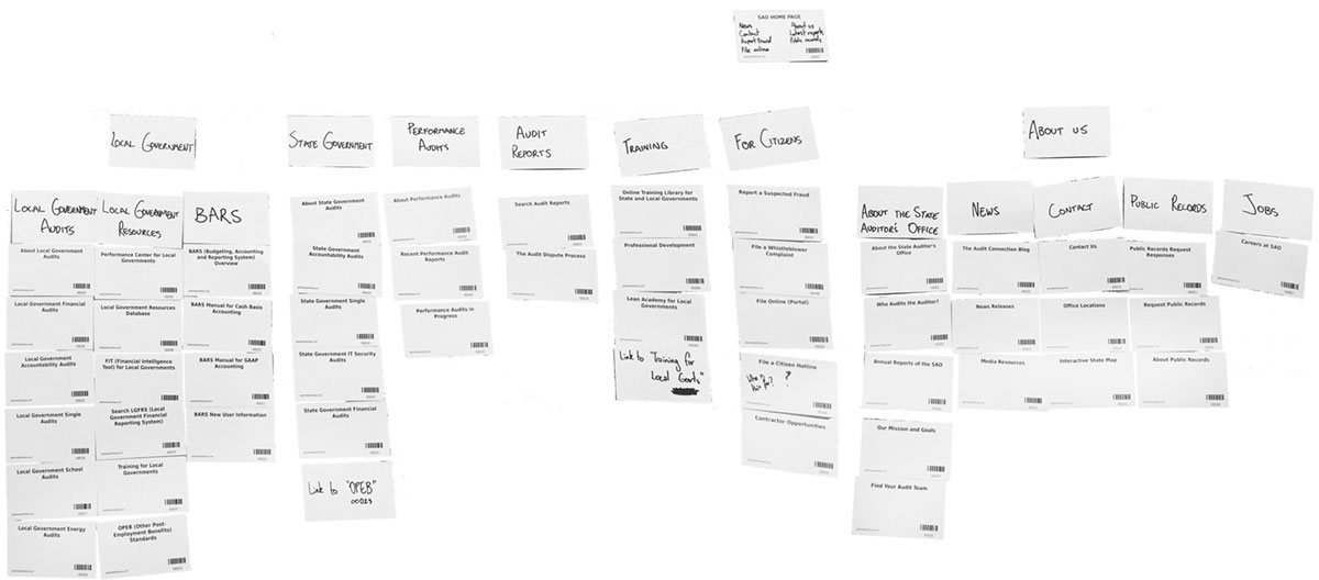
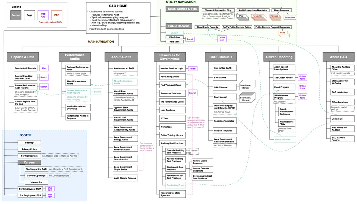
SAO website: design methodologies

Once the site structure was firmed up, I moved into the UX and UI design phase, first blocking out the page structures and user flows in grayscale wireframes, then overlaying the look and feel of the public website and the BARS manuals system. All UX and UI prototypes were delivered online in an interactive format, so the client could experience a simulation of moving through their website before it was built.

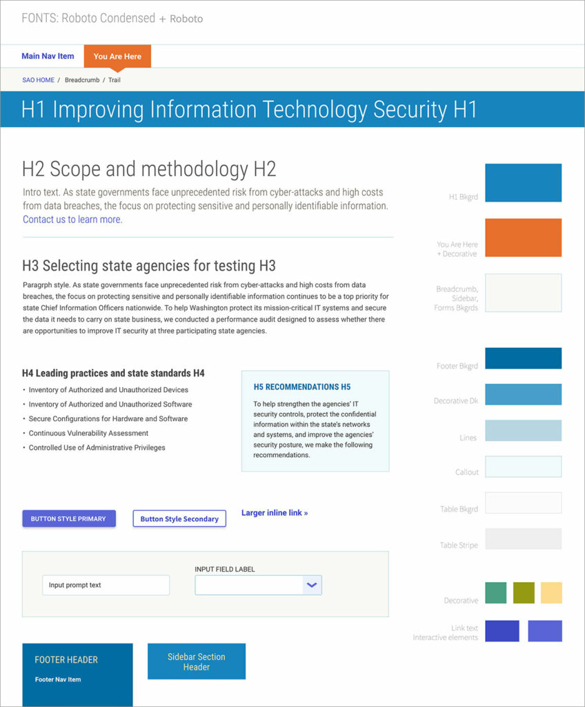
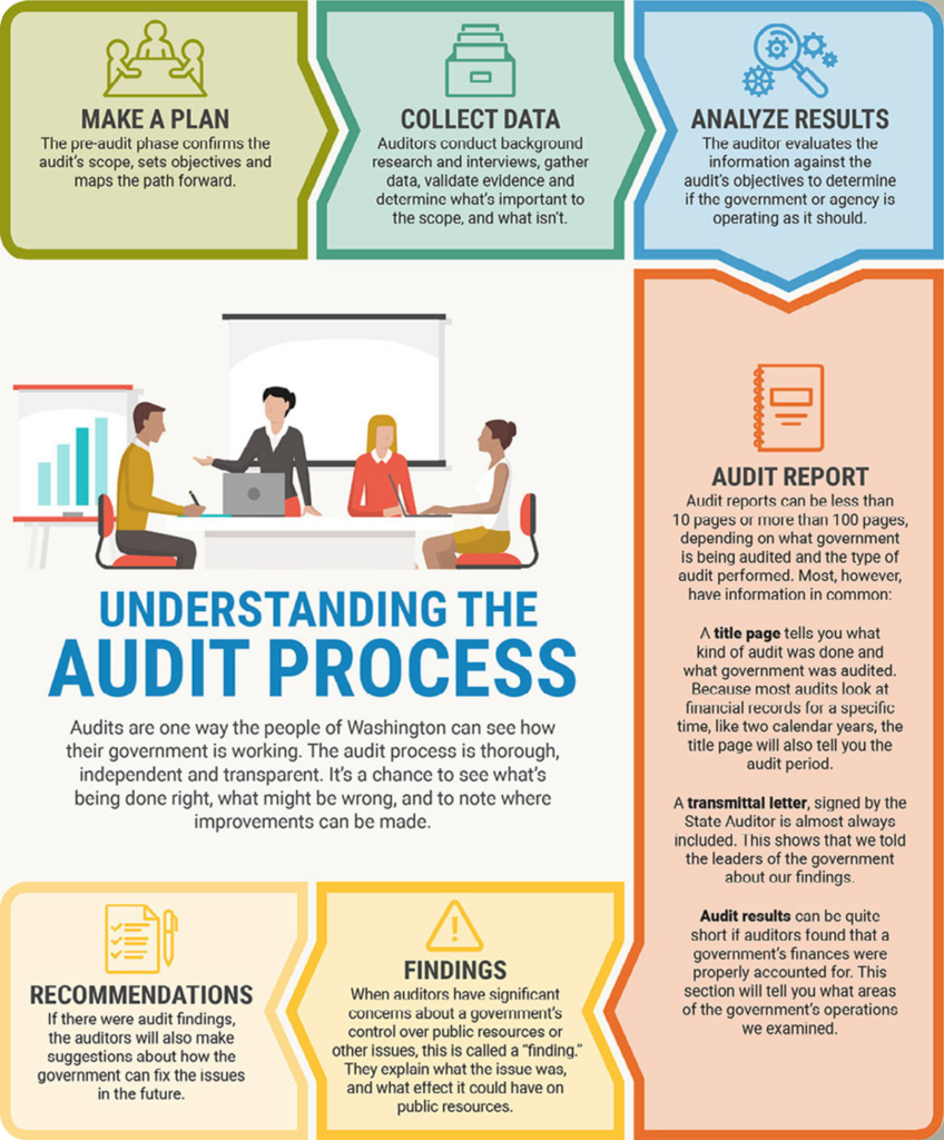
I created a fresh, bright, and approachable color scheme and font system to carry across all parts of the site, and creative-directed infographics to enhance user engagement.

Grayscale wireframe of a page about improvement resources on the Washington State Auditor's Office website.
Wireframe of a page of resources for local governments.
Final design of the same page about improvement resources on the Washington State Auditor's Office website.
Final design of the same page of resources for local governments.
Style tile for the Washington State Auditor's website, showing fonts and colors.
Style tile for typography and colors.
Infographic depicting the audit process. Make a plan, collect data, analyze results, create audit report, identify findings, make recommendations.
Facilitation of custom infographics.

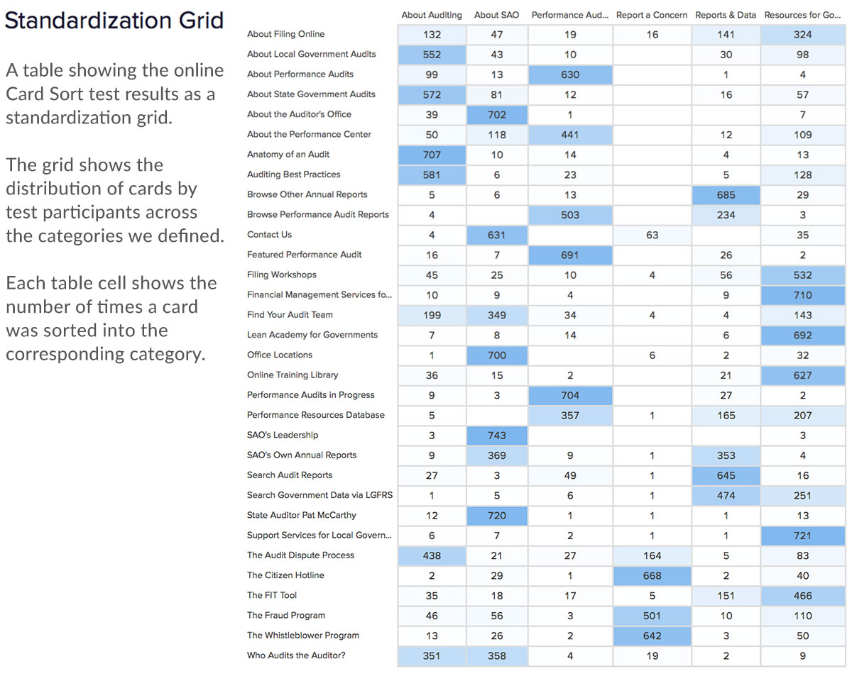
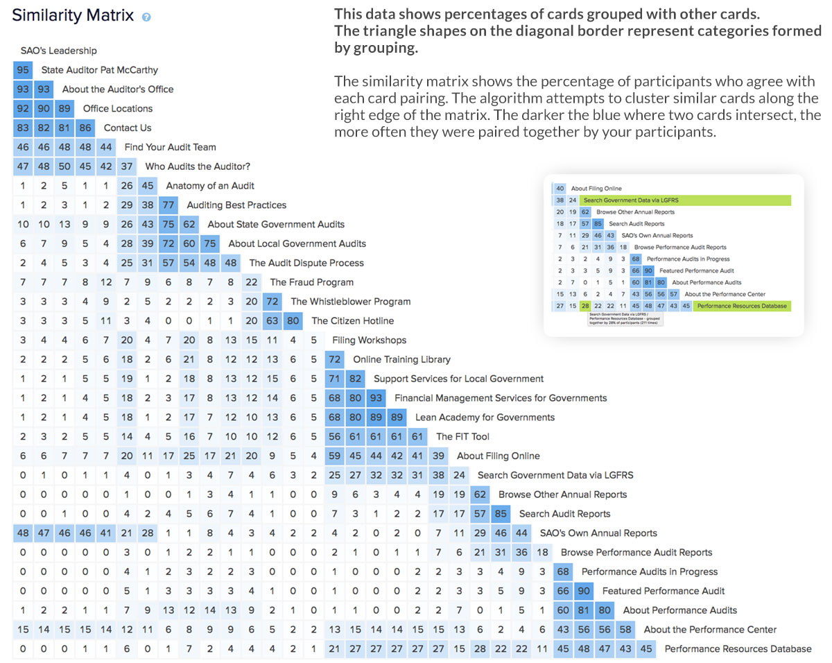
SAO website: testing and launch

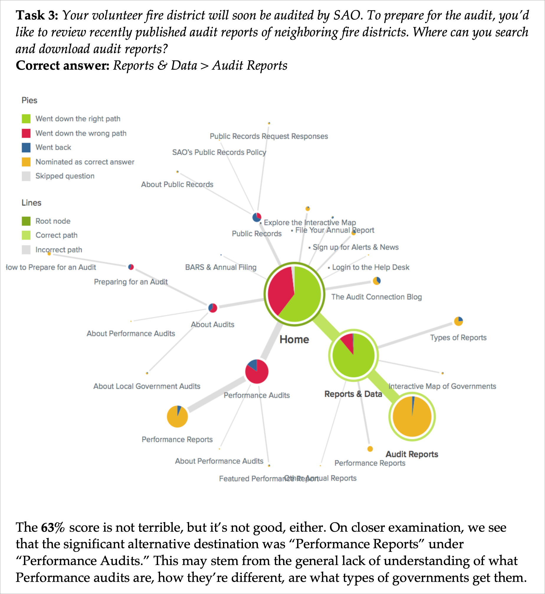
Extensive testing of the interactive map and search forms ensured seamless integration with SAO’s databases. A final in-person focus group validated the revised information architecture and user experience, and reassured the client that the restructuring and naming changes were sound choices.

Conclusion

The redesigned Washington State Auditor’s website now better reflects SAO’s integrity, values, and personality. It enhances the user experience for over 2,000 government liaisons and increases public awareness of SAO’s value through improved access to information and a more attractive, user-friendly interface.

Explore more

A brief user experience research + design case study.

An overview of selected websites I designed at Gard.

My UX Design philosophy, plus my skills and tools.

Get in touch!

Looking forward to hearing from you 😊

Scroll to Top